 Studio Off Hours
Exploring Color Theory: Enhancing Your Art with Science
Color theory is an essential part of the creative process, bridging the gap between science and art. Artists and makers often rely on their intuition, but understanding the scientific principles behind color can significantly elevate their work. This exploration of color theory seeks to delve into how color affects perception, emotion, and design. It offers insights into how artists can use this knowledge to enhance their creative practice. By examining key elements like the color wheel, harmony, and contrast, as well as the psychological impact of color, creators can craft more compelling and coherent pieces. Let’s delve into the vibrant world where art meets science, and discover how to leverage color to its fullest potential.
The Foundation: Understanding the Color Wheel
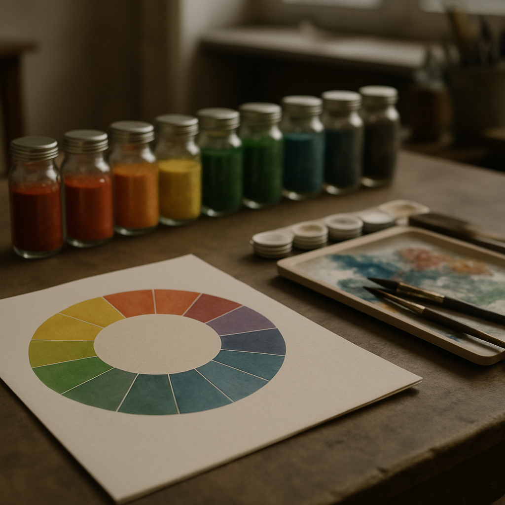
The color wheel is often the starting point for anyone interested in color theory. Developed in the 17th century by Sir Isaac Newton, the color wheel organizes colors around a circle, showing the relationships between primary colors, secondary colors, and tertiary colors. Primary colors—red, yellow, and blue—are the building blocks for all other colors. Secondary colors, such as green, orange, and violet, are created by mixing primary colors. Tertiary colors result from mixing a primary color with a secondary color, adding depth and nuance to the palette.
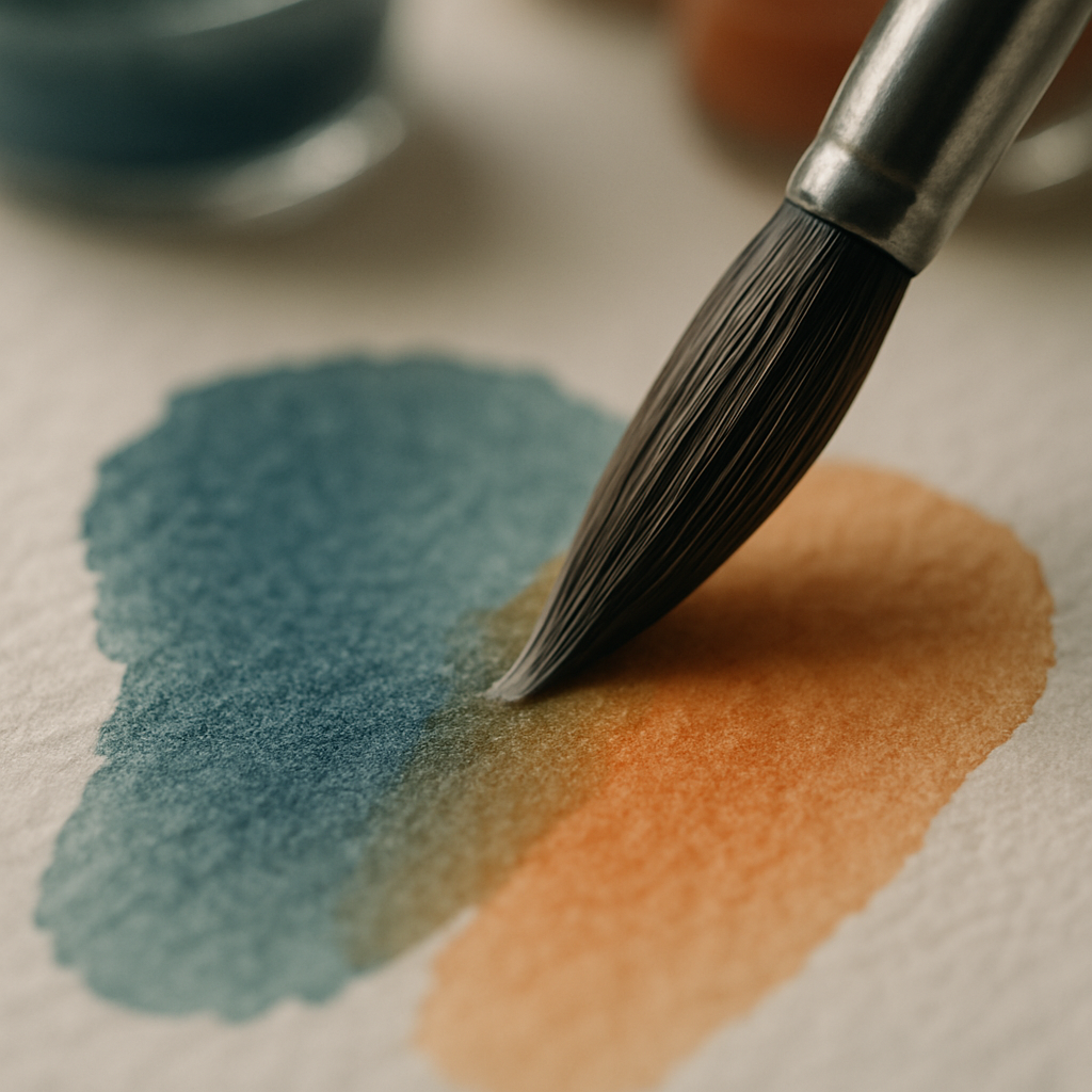
Understanding the color wheel allows artists to recognize complementary colors, which are opposite each other on the wheel, such as red and green. Using complementary colors can create vibrant contrasts that make artwork pop. This principle is a staple in design from Monet’s Impressionist paintings to modern digital art. Complementary color schemes are particularly useful in creating visual tension and interest, as they draw the viewer's eye and generate excitement in a composition.
For artists working in different mediums, the color wheel serves as a guide for mixing pigments, selecting digital palettes, and even choosing materials in textile design. Companies like Pantone have built their entire brand around standardizing colors, providing artists and designers with consistent color references. Understanding the relationships between colors on the wheel helps in achieving harmony in design, ensuring that the end result is both aesthetically pleasing and conceptually sound.
Harmony and Balance in Color Combinations
Achieving harmony in color combinations is a crucial aspect of creating visually appealing art. Harmony involves the arrangement of colors in a way that is pleasing to the eye. There are several traditional color schemes that artists use to ensure harmony, including analogous, complementary, and triadic color schemes. Analogous color schemes use colors that are next to each other on the color wheel, such as blue, blue-green, and green. This creates a serene and comfortable design, often found in nature’s palettes like the calming hues of a forest or the tranquil shades of the ocean.
Complementary color schemes, as mentioned earlier, use colors directly opposite each other on the wheel. This creates a high contrast and high impact effect, often utilized in marketing and advertising to grab attention quickly. Triadic color schemes involve three colors evenly spaced around the wheel, such as red, yellow, and blue, offering a vibrant and lively outcome without the tension created by complementary colors.
Artists often experiment with these schemes to evoke specific moods or themes in their work. For instance, Wassily Kandinsky, a pioneer of abstract art, was known for his complex color compositions that balanced harmony and contrast to convey emotion. In contemporary settings, designers at companies like IKEA use color schemes strategically in their products and showrooms to create inviting and harmonious spaces. By learning to manipulate harmony and balance in color combinations, artists and makers can enhance the emotional and aesthetic impact of their creations.
The Psychological Impact of Color
The psychological impact of color is profound, influencing mood and behavior in subtle yet powerful ways. This area of color theory examines how different hues affect our emotions, making it an invaluable tool for artists and designers. For example, blues and greens are often associated with calmness and tranquility, while reds and oranges can evoke excitement and warmth. Understanding these associations allows creators to tailor their work to elicit specific emotional responses.
Studies have shown that color can impact not only emotions but also decision-making and perception. In branding and marketing, companies like Coca-Cola have capitalized on the association of red with excitement and passion to craft a powerful and recognizable brand identity. Similarly, tech companies like Apple use sleek, neutral tones in their products to convey sophistication and modernity.
Artists harness these psychological effects to enhance the narrative and emotional depth of their pieces. For instance, in film and photography, color grading is a crucial post-production process that sets the emotional tone of a scene. Directors like Wes Anderson are famed for their distinctive use of color palettes that contribute to the storytelling. By understanding color psychology, creators in various fields can deliberately influence the viewer’s experience, crafting work that resonates on a deeper emotional level.
The Role of Technology in Modern Color Theory
Technology has revolutionized the way artists engage with color, offering tools and platforms that make understanding and applying color theory more accessible than ever. Digital software like Adobe Photoshop and CorelDRAW provide advanced color management systems that allow creators to experiment with limitless color palettes. These tools offer features such as color wheels, harmony rules, and palette generators, making it easier for artists to implement color theory principles in their digital work.
With the rise of digital platforms, artists also have access to a global audience, allowing trends in color usage to disseminate quickly across cultures and industries. Social media platforms like Instagram have influenced color trends, with filters and presets shaping public perception of color aesthetics. The digital age has seen collaborations like that of Adobe and Pantone, where digital libraries of Pantone colors are available in design software, ensuring color consistency across digital and print media.
Augmented reality (AR) and virtual reality (VR) are also extending the possibilities for color interaction, allowing users to experience and manipulate color in immersive environments. This is particularly noteworthy in fields such as interior design and fashion, where visualizing color schemes in a virtual space aids in decision-making. As technology continues to evolve, the tools available to artists and makers will expand, offering even more ways to explore and apply color theory.
Practical Applications: Enhancing Your Art with Color
Incorporating color theory into creative practices goes beyond understanding concepts; it involves practical application to expand an artist’s toolkit. For painters, mastering color mixing and understanding pigments' properties can lead to richer, more dynamic canvases. For digital artists, utilizing software tools to experiment with color harmonies and contrasts can transform digital illustrations and designs.
In fashion design, color choice is crucial in conveying brand identity and responding to seasonal trends. Designers like Stella McCartney are known for their expert use of color to communicate elegance and sustainability. Understanding the seasonal color theory, which categorizes colors by Spring, Summer, Autumn, and Winter palettes, can help fashion designers create collections that resonate with their audience on a subconscious level.
In interior design, color can transform spaces by influencing the perception of size and light. Companies like Farrow & Ball specialize in creating unique paint colors that interior designers use to create mood and style in homes and commercial spaces. By applying color theory, designers can enhance functionality and aesthetics, creating environments that support well-being and productivity.
Ultimately, integrating color theory into creative practices empowers artists and makers to make informed choices that deepen the impact of their work. By understanding and applying the principles of color, creators can craft pieces that not only are visually stunning but also resonate with audiences on a psychological and emotional level.